1. Introduction: The Chart vs. The Reality
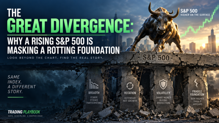
To the uninitiated, a rising stock chart is the ultimate green light. But for the seasoned strategist, price action in a vacuum is little more than a hallucination. While price is undeniably the only true leading indicator, it requires “under the surface” confirmation from broader market internals to be reliable. When a market climbs without the support of its constituent parts, it isn’t a rally; it’s a trap. To navigate the current landscape, we must look past the surface-level indices and interrogate the engine room of the economy. If the internal mechanics—breadth, rotation, and volatility—aren’t aligned with the price, the foundation is far more precarious than it appears.
2. Takeaway 1: The “Best” Indicator is the One You Actually Stick To
One of the most frequent mistakes I see traders make is the “wrong ruler” syndrome. They cycle through a 20-day moving average one day and a 50-day simple or exponential average the next, searching for the “perfect” setting that confirms their bias. This inconsistency is the enemy of profit.
The solution isn’t finding a magical metric; it is implementing a system with fixed parameters that forces objective consistency. One method is to rely on specific one-month and six-month trend indicators that cannot be toggled or tweaked. By using the same “ruler” to measure every asset—from stocks to bonds to commodities—you gain a reliable, repeatable view of how the market character is actually shifting.
“There’s no such thing as a best moving average… what’s much better for traders is not saying what’s best but what suits my trading style and most importantly sticking to that one indicator every single day.”
3. Takeaway 2: Why Outperformance Isn’t Always a Good Sign
Currently, we are seeing a significant rally in oil, gas, and energy. In a vacuum, sector leadership is a sign of health, but the “why” behind this move is a major warning sign. This outperformance is not being driven by an economic boom or a “risk-on” appetite; it is a direct symptom of fear stemming from the Iran war.
When leadership is a byproduct of geopolitical instability rather than growth, it is a defensive signal, not a bullish one. This is confirmed when we look at the laggards: “risk-on” sectors like Homebuilders and Airlines are conspicuously absent from the leaderboards. Instead, the rotation is flowing into “safe havens” like Treasury bonds, Utilities, and the US Dollar. When the market’s only engine is a war-driven commodity spike, the broader economy is in a much more defensive posture than the S&P 500 headline suggests.
4. Takeaway 3: Market Breadth—The 121 vs. 41 Problem
A healthy bull market is a “rising tide that lifts all boats.” Today, we are seeing the opposite. The data reveals a stark divergence: 121 stocks are currently underperforming the market, while a mere 41 stocks are showing relative strength.
This deterioration is exacerbated by a technical “bifurcation” within the Technology sector. Over the past several weeks, we have seen a constant flip-flop between Software and Semiconductors. When one gains momentum, the other stalls. Because these two sub-sectors are the primary engines of the market, this lack of synchronization prevents the Technology sector from providing the “lift” necessary to sustain a broad rally. With more sectors joining the “underperformance” group, the risk of a sharp pullback is high, even if the index hasn’t fully rolled over yet.
5. Takeaway 4: The “Skew” Warning—Investors are Paying for Protection
While the VIX remains relatively contained in its 38th percentile, the “smart money” is expressing deep concern through the Skew. For context, Skew measures the cost of out-of-the-money puts (downside protection) against out-of-the-money calls (upside participation).
In a balanced, “normal” market, the Skew typically hovers around 100. Recently, we saw the Skew reach an extreme of 150. This is a lopsided, historically significant reading. It tells us that professional investors are paying a massive premium for downside protection because they are significantly more worried about a correction than they are about missing a further move higher. When institutional players are this aggressively “buying insurance,” it is a signal that the market’s internal volatility is far higher than the VIX suggests.
6. Takeaway 5: Chasing the “Late” Move vs. Finding “Early” Candidates
The most dangerous move a retail investor can make is chasing an “established leader” that has already moved 20% to 30%. To avoid buying at the top of a cycle, we utilize a color-coding system to segment stocks by the maturity of their trend.
In this model, lighter colors represent “early” breakout candidates—stocks just beginning their shift into outperformance. By focusing on these lighter-shaded candidates rather than the dark-shaded “late” leaders, traders can enter positions with a much better risk/reward profile. Identifying these shifts in rotation early allows you to participate in the “meat” of the move rather than becoming the liquidity for professionals exiting their mature positions.
7. Conclusion: The Art of the Macro View
Successful market navigation is an art that balances the four pillars of Trend, Rotation, Breadth, and Volatility. While the internal data paints a bearish picture, price remains the final judge.
The 760 level on the SPY is our critical line in the sand. As of now, the market is testing this support, but it hasn’t completely fallen apart. However, the “under the surface” rot we’ve discussed is real. If the price breaks below that 760 level, the bearish conviction of the internals will become the new market reality.
As you look at your portfolio today, ask yourself: are you trading the surface-level hallucination, or are you prepared for the reality underneath? Knowledge of these signals is the only thing standing between a prepared investor and a blindsided one.